Monday, 21 September 2015

COLOUR STUDY-LIGHT AND DARK COLOURS(DISNEY CHARACTER)

LIGHT AND DARK COLOURS

In this exercise, we need to pick and draw one of the Disney character that we admire, then we have to fill in using light and dark colours.
I draw a gender bend Elsa from Frozen

Colours that I used: Black, Light Blue, Yellow Ochre and some yellow 
                               Purple, Pink, White, Grey and a little bit of Brown
also, pale yellow.


Friday, 18 September 2015

COLOUR STUDY-Colour wheel

COLOUR WHEEL

color wheel or color circle[1is an abstract illustrative organization of color hues around a circle that shows relationships between primary colorssecondary colors, tertiary colors etc.

PRIMARY COLOUR: RED, BLUE, YELLOW
SECONDARY COLOUR: GREEN, ORANGE, PURPLE
TERTIARY COLOUR: YELLOW, YELLOW ORANGE, ORANGE, RED ORANGE,
                                  RED, RED PURPLE, PURPLE, BLUE PURPLE, BLUE, BLUE           GREEN, GREEN AND YELLOW GREEN
The secondary colour is a product from mixing the primary colour
The tertiary colour is a product from mixing the secondary and primary colour except for red, blue and yellow

COLOUR STUDY- COMPLIMENTARY COLOUR

Complimentary colours

Complementary colors are pairs of colors which, when combined, cancel each other out. This means that when combined, they produce a grey-scalecolor like white or black. When placed next to each other, they create the strongest contrast for those particular two colors.


FROM LEFT 1ST ROW:
Orange/green, red/yellow/, blue/red

FROM LEFT 2ND ROW:
Red-purple/Yellow-Green, Purple/Yellow, Red-orange/blue-green 


COLOUR STUDY-COLOUR HARMONY(INTERIOR)

Colours Harmony

In this exercise, we have to draw things in the living room like sofas and tables, then we have to colour it, and make sure the colours match harmony.

           Color harmony is the theory of combining colors in a fashion that is harmonious to the eye. In other words, what colors work well together

  Colours used: Orange, purple, light blue, yellow and red-purple

COLOUR STUDY-BLIND COLOUR

Blind Colours

In this exercise, we need to draw a bear and a number using the Blnd colours technique, we can pick any colours that we want .

Wednesday, 16 September 2015

COLOUR STUDY-CAMOUFLAGE COLOUR

Camouflage Colours

Camouflage colours-   Camouflage is the use of any combination of materials, coloration, or illumination for concealment, either by making animals or objects hard to see, or by disguising them as something else.
--(of fabric or clothing) having a design of irregular patches of dull colours (such as browns and greens), as used in military camouflage 


  In this exercise we need to draw a vase, any shape, and apply the camouflage colours, any colours. 


BASIC DRAWING-STILL LIFE ,ORGANIC AND MODEL DRAWING (ASSIGNMENT 3)

BASIC DRAWING


              Organic life drawing

eg: fruits, stones, animals or any plants

 We have to pick several organic object and draw it, at least in 5 different view/angle. Providing suitable degree of lightness and darkness that we have to include in the drawing

I grab 2 stones with different shapes and pluck some little
flowers, and i arrange it in suitable position, and started
sketch it and add suitable degree of lightness and darkness


                          STILL LIFE DRAWING

In this exercise of still life drawing, we have to pick any object, still object , arrange them in suitable position and draw it. We can draw from any angle that we want and also, providing suitable degree of lightness and darkness
This is the setup of what i will draw this pic isfrom different angle

This is the outcome of the drawing, the pencil and the eraser
i decided to add it last minute


MODEL DRAWING

For this exercise, we have to draw a model who is posing for us on the stage from our angle/view, providing suitable degree of lightness and darkness in our drawing.

This is how my drawing outcome based on my angle


BASIC DRAWING-SHADING TECHNIQUE AND DEGREE (ASSIGNMENT 2)

SHADING TECHNIQUE AND DEGREE

In this exercise we have to use 5 different technique of shading and use the correct degree of darkness and lightness

The 5 technique: Stipple,Hatching,Scribble,Smudging and Cross-hatching

     The first one we have to use both pen and pencil using both technique
                 and apply the right degree of lightness and darkness

The second task is to apply the technique onto 4 different shapes by using the right degree of darkness and lightness

BASIC DRAWING-GESTURE DRAWING (ASSIGNMENT 4)

GESTURE DRAWING

In class exercise we have to draw several gesture poses by our fellow friends in a given time which is for 3 minutes, 2 minutes, 1 minute, and 30 sec


THIS IS SOME EXERCISE DRAWING IN THE CLASS

Then we have to do extra 40 gesture drawing for homework 
One poses in one minute

THIS ARE SOME OF THE DRAWING


BASIC DRAWING-CONTINUOUS AND BLIND CONTINUOUS (ASSIGNMENT 4)

Continuous and Blind continuous drawing

We have to draw 20 hands with different poses using both continuous and blind continuous

Second exercise we need to draw 5 faces using both technique as well


Below are some continuous and blind continuous drawing


                                                        This are some of the Continuous drawing 
                                                       of the faces and the hands


While, this are some of the blind continuous drawing of hands and faces

Saturday, 5 September 2015

BASIC COMPUTER-FINAL PROJECT

Basic Computer Final Project

For basic computer final project we have to draw some sketches and make the drawing become to life using adobe illustrator and adobe photoshop. This final project has 3 process to be done.

Sketch about 5 sketches onto A4 paper and pick the best one. I decided to do a doodle style.


and the sketches that i pick is the third one..


Transfer the artwork that have been chosen into Adobe Illustrator
Trace the artwork using Adobe Illustrator,at least 20% have been done


Trace the artwork using pen tool, and using some shapes for some 
obvious shapes.


After tracing the artwork, press Ctrl+y to see the outline 


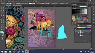
To achieve colour harmony in my artwork, i google some
of the other artwork and used the colour in that particular
artwork for my reference.
I place the chosen artwork beside mine, and i experiment
with the colour

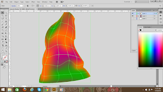
For example,this shape,i decided to use mesh tool
to make it look more interesting by using mesh tool
to create gradient


This is the outcome(right side) after i fill in the colour
for my artwork

This the outcome from adobe illustrator


After i have done with the artwork in
Adobe Illustrator
I export the artwork into
Adobe Photoshop

After i export it, convert the layer into smart object by 
right click at the layer


Then i adjust the brightness,contrast,curves and levels
of the artwork

After that I open new file and transfer it there


I add texture and some effects onto my artwork
For example grain texture and stained glass texture
I also add the blue colour as the background


And this is the outcome..